Prior to working at Indeed, I’ve never worked on accessibility (a11y) before. I started working on accessibility back in 2020 when Indeed decided to take it more seriously in order to avoid getting slap with a lawsuit. Prior to this, my knowledge and experience with accessibility is non-existent and it is limited to knowing a handful of aria tags and basic handling of keyboard navigation.
While I no longer work at Indeed, I’ve learned some valuable things about accessibility along the way. I’ve had three years worth of experience triaging and fixing accessibility issues and these are the advice that I wish I had when I first started.
#1: A11Y is not an afterthought
There were some growing pains that I experienced when accessibility was mandated as being critical. In the beginning, people focused on fixing existing bugs rather than introducing workflows that could prevent issues from happening in the first place. Once all the issues were solved, people just went back to their merry ways of product development.
I didn’t see accessibility concerns being actively discussed in design or product meetings. As a result, I’ve gone through a few product development cycle where we had to delay the release because the feature didn’t pass the accessibility audit. This was really common during the early days given that internal resources on accessibility are limited and the only due diligence an engineer would do is to just run the AXE Chrome extension on their page and call it a day.
I decided to become proactive in my approach by reviewing wireframes and cross-referencing elements to ensure that it meets the requirements outlined on the WCAG guidelines. This was done before development began and when the team was still in the design discussion stage. Depending on the issues, I would either suggest alternatives or look for existing solutions. I’ve experienced several product release cycle with 0 accessibility issues during audit and the secret to it was just to care a little bit more about accessibility.
Initially, Indeed’s internal resources for accessibility was sparse. I rely on resources like No Style Design System and ARIA Authoring Practices in order to cross-reference wireframes and plan for development. If you’re working at a place that do not have internal resources on accessibility, I suggest looking at these resources that I’ve frequently used.
Overtime, Indeed started growing the accessibility resources within the organization and working with it became much easier. Accessibility is baked into the internal component library and documentations were written to inform us on how to approach common accessibility issues. There were also specific documentation sites that listed common component patterns at Indeed and how to ensure that it is accessible. Reviewing wireframes become so much easier for me as I have documented internal information to back my findings. This taught me several things about approaching accessibility.
It is costly to deal with accessibility later
I’ve spent an entire quarter fixing accessibility issues alone, a quarter that could have been spent on growing the business rather than retrofitting fixes in an attempt to avoid lawsuits. Accessibility should be incorporated before development begins, starting with UX and design. Designers should address accessibility concerns earlier on in their wireframes. For designers that are not familiar with WCAG guidelines, they should be supported and it’s the engineers role to partner closely with them in order to highlight potential issues and suggests possible alternatives.
Working with accessibility is a bit like working with web performance.
You would have mechanisms in place to help monitor performance and let you know when the performance degrade. A better mechanism would even let you know that performance can potentially degrade before a feature is deployed. The same approach applies to accessibility. There should be processes in place to audit and review accessibility and it should also be embedded in the testing pipeline.
Accessibility should be part of an organization’s culture
I don’t think it is possible to be successful in building an inclusive product without including accessibility in the organization’s culture. Not only would it be performative but the designers and engineers are not set up for success if there are no resources for them to learn. Indeed has amazing people in their accessibility teams to educate others, established guidelines, and create documentations about building inclusive components. There’s frequent lunch and learn meetings that are being held within the organization in order to spread awareness about its importance as well as tips and tricks in solving issues related to assistive technologies. I believe that dedicated teams or people should exist in championing accessibility for it to be successfully practiced and implemented in products.
#2: Be aware of common accessibility issues and how to manually test them
My knowledge on accessibility was non-existent prior to the mandate being introduced. So imagine my horror when I was looking at the bug list and encountering problems that I have never had to fix before. It also reminded me of my privileged ability in never having to struggle in dealing with devices. I also learned that accessibility is for everybody and every body. It is not just for the disabled and older folks. It is also for able bodied folks who are injured, who have limited mobility, and also for the ones who may need to access the web in a different way.
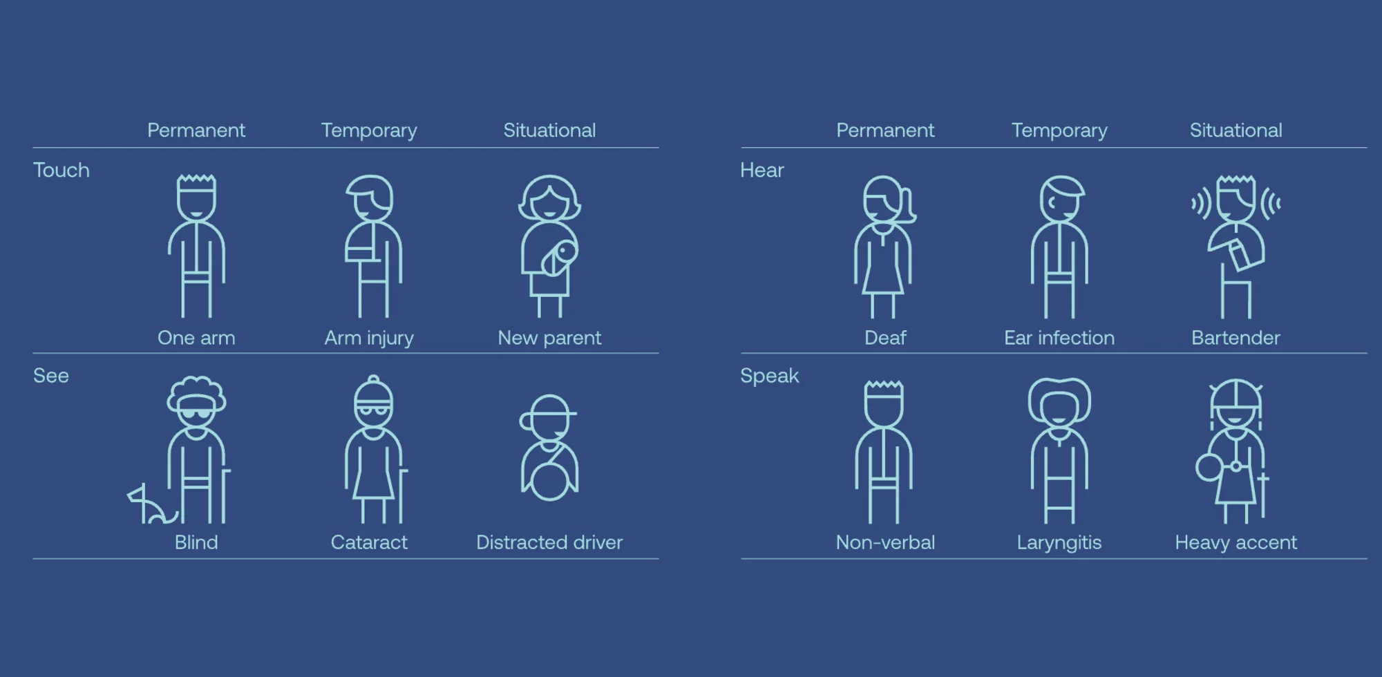
An overview of potential user groups that benefits from accessibility. (Image credit: Microsoft (Inclusive Design))
Throughout my time at Indeed, I’ve encountered a diverse number of accessibility issues and it often includes focus management and problems related to assistive technologies.
Focus management
I have lost count on the number of focus management bugs that I had to fix over the years and I believe that every accessibility-aware developers should get comfortable with it and include it in their tests. Focus needs to be explicitly handled in order to prevent unannounced information or focus lost. One of the issues I often encountered is when focus is not change as new information appears on the screen. This can be disorienting to screen reader users as there’s no assistance to direct them to the new information.
While the component below works well for sighted users, it is not accessible and screen reader users do not know that the list can be toggled.
It’s quite common to write it this way amongst engineers who are not familiar with accessibility. I should know since I used to be one.
In order for this to be accessible, the button should have an aria-expanded attribute to inform screen reader users that it is a toggle button. Once it is clicked, it should focus on the first item that is visible.
Focus Lost
At its best, focus lost can be seen as a usability issue rather than an accessibility issue. At its worse, the focus is lost in a manner where keyboard navigation no longer follows sequential reading order of the page. In my experience, this happens when the DOM that the focus is currently on is removed from the page. As an example, let’s look at the modal implementation below.
An example of focus lost during keyboard navigation. Pay attention to the HTML markup of the page.
When the close button is clicked, the focus will be lost and it will move outside of the page. This is due to the HTML structure. Even though the last button appears at the end, that is not the true order in the markup structure. The modal’s markup is the one that is located at the end of the HTML code. Therefore, focus will be lost since there’s no element that comes after the modal as the close button is the final element that can be interacted with.
There are two ways to fix this. We can either move the modal’s markup to the middle of the page so that the order of the structure will match the page’s reading order or we can set focus back to the button that triggers the modal.
I believe setting the focus back to the original button is a better solution than rearranging the HTML markup. At times, we may not have control over the markup especially when we are dealing with third party libraries. We have all encountered libraries that would add markups at the end of the page. A library that adds tooltip dynamically comes to mind. These tooltips would appear in different locations visually but when you examine the markup, the tooltip structure is located right above the closing tag of </body>. Some of the most tedious focus lost bug that I’ve encountered is caused by third party libraries. This is why it is important to consider accessibility when choosing a library to work with.
Disabling background control
Let’s look at the modal example again. A common issue related to dialog and modal components is that users are still able to interact with the elements behind the modal when it is active.
This issue can be disorienting and confusing to users who are using screen readers or keyboard navigation. Background control should be disabled but this requires complex steps that involves:
- Focus trap with Javascript to keep the focus inside the modal.
- Walk the DOM for elements outside of the modal and put
tabindex="-1"on each focusable elements in order to remove it from the tab order. This is to ensure accessible behavior on mobile devices. - Put
aria-hidden=trueon the container of the inactive content so that it won’t be announced by screen readers.
This is quite complex to achieve and it’s tough to make sure that it works on all browsers as well as on both desktop and mobile screen readers.
Fortunately, there is a way to disable inactive content easily by using HTML5 inert attribute. It’s best to use the polyfill to ensure that it works expectedly on all browsers. With this attribute, control can be disabled for an entire region on a page and it’s no longer necessary to do focus trapping or DOM walking to disable control from elements. Here’s an example of the same modal with inert for an accessible experience.
For the purpose of the pen, I added an extra focus trapping in order to ensure that focus do not move outside of the pen.
Notifying screen reader users
If you’re developing accessible components, chances are you’ll be working with live regions. A good example of using live regions is notifying users of success or errors after form submissions. For announcing success messages, it is quite straightforward. Using aria-live="polite" will announce the success message without moving the focus away from the element that the user is currently on.
Announcing error messages are a little bit more involved. While it is important to let the users know that errors have occured, it is equally important to get them to the place where they can fix those errors and resubmit the form. A good pattern would be to set focus to the alert box that lists out all of the errors in an unordered list. Each of the list item is a skip link that sets the focus back to the erroneous form field. Here’s a good example of an accessible form pattern from No Style Design System.
The issues that I listed in this section are by no means an exhaustive list. You might encounter other accessibility issues that are more advance along the way. However, these are the most common ones that I’ve encountered and I believe that these examples include foundational knowledge on what it takes to build accessible components.
Testing on screen readers
While it is valuable to know common accessibility issues, it is also important to know how to test them. As someone who have never used screen readers before, I must admit that it was confusing when I first started. Understanding how to use voiceover wasn’t difficult but it can be difficult to know what to look for when you are not familiar with the subject. What works for me is to have a frequent communication with accessibility consultants and experts at Indeed. For my first complex accessibility bug, I requested an expected voiceover announcement. This makes it easier for me to test and ensure that the component is behaving as expected with assistive technologies.
The support for HTML and ARIA attributes varies based on browsers and screen readers. This means that screen readers may behave differently depending on the browser used, which can vary. My browser of choice is Firefox but I’ve learned that it’s not part of the common testing matrix for accessibility. Therefore, it’s important to define which browser and screen reader combinations your team should use to test on as it’s impossible to test on every screen readers and browser combinations. I don’t entirely remember what the testing matrix look like at Indeed but I believe it’s something like this:
- Voiceover with Safari and Chrome on OSX
- NVDA and Jaws with Chrome on Windows
- Talkback with Chrome on Android
I usually test with Voiceover on Safari and Chrome. I rarely test with NVDA and Talkback as I don’t have the required device. So I tested solely on Voiceover and I am fairly confident that the announcement pattern would be consistent across all screen readers as long as I follow established standards and best practices.
However, I do experience accessibility issues that only happen on specific screen readers such as NVDA or JAWS. If that happens, Indeed provided us with Amazon WorkSpaces, a useful tool that allows me to access windows environment on any device. This is where I would debug NVDA or JAWS specific issues.
In my experience, issues that occur only on one specific screen reader are rare. If it happens, it usually involves a third party library that I have no control over. This is one reason why I would avoid libraries and prefer components built internally by Indeed’s design system team. If you have to use a library, prioritize accessibility and performance in the criteria of your choice. When it doubt, visit the ARIA Authoring Practices to guide you in writing accessible components from the ground up. There’s also Smashing Magazine’s complete guide to accessibility, covering accessibility for common components widely use throughout the web.
#3: Testing accessibility
During my time at Indeed, we did both automated and manual testing for accessibility. Indeed had a dedicated team that is responsible for auditing accessibility before a product is released and it’s a requirement that a feature be 100% accessible before launch.
We did several automated testings in order to free up people power so that they can focus more on testing complex tasks rather than basic violations that can be caught easily. At Indeed, I saw two common automated testing strategies approached by many teams.
Unit test interactions and focus management
Focus management is one of the major issues that I’ve often encounter. It is worth testing for the expected focused element for specific components that are meant to send focus elsewhere after an interaction occur.
If we were to take the togglable list component above and write a code to test for focus settings, it will look like this:
import { render, fireEvent } from "@testing-library/react";
test("focus on the right element", () => {
const { getByRole, getByText } = render(Adding accessibility test to the build process
I used axe-core to integrate accessibility in the testing pipeline. It’s really useful to help you catch problems related to ARIA attributes, color contrast, and HTML semantics that you might have missed. There’s a chrome extension that you can run manually as well.
It’s important to note that it’s not possible to rely on automated testing alone. Manual testing is still required for testing interactions with keyboards and screen readers both on desktop and mobile devices. Some of these scenarios can’t be automated and it needs human testing. Therefore, it is important to have a process that includes manual testing before deploying features. In my opinion, an organization should invest in a dedicated accessibility team to help manual testing and also educate others on running manual tests on their own.
#4: Prototype complex interactions as soon as possible
One thing that helped me in reducing accessibility issues was to prototype complex interactions as early as possible. It can be overwhelming to debug and fix accessibility issues on complex interactions when discovered later. In order to save time, it is good to prototype and catch early accessibility issues so that decisions can be made on whether the issue can be solved with code or if the interaction should change entirely.
Create small test cases for debugging accessibility
Ultimately, you may follow this entire guide and accessibility bugs can still occur. Perhaps it occured on a legacy component that is built by others who do not have comprehensive knowledge on accessibility. When bugs happen, it is important to know how to debug it. This is especially important when bugs occur on assistive technologies used in mobile devices.
For most of us who works on development environment that may not be easily accessible through personal devices, debugging accessibility may be easier said than done. In my case, certain features are gated by VPN and I can only access those features through my work device.
In order to make it easier for me to debug, I would create a small test case to replicate the feature on CodeSandbox. It is not ideal as I need to try and replicate the issue as accurately as I can but it is something that works for me.
Developing accessible components is not hard
It just takes a little bit of care before jumping into development. Knowing about common problems helps me to consider accessibility issues before I start developing, which then ensures that I’ve got all the bases covered. Along the way, I learned how to work with assistive technologies and how to reproduce and test common issues manually.
I still have a lot to learn about accessibility and I am grateful for the time that I had learning about it in a professional setting. Acquiring a better understanding of accessibility has made me more attuned to the need for creating products that are inclusive. As a result, I’ve seen a change in my problem-solving approach. Instead of immediately diving into coding like I used to, I now take the time to plan my work, which has resulted in more durable code.
I wrote this guide because I wish I had something like it when I was just starting out with accessibility. I hope it helps someone who’s just starting out in building accessible products.