CSS Grid is awesome and that is because it is a new tool that makes working with layouts much easier. This post is not going to be about how to work with CSS Grid; I think there are plenty of posts and resources out there. This is going to be a documentation of my creative process of coming up with unconventional layouts since CSS Grid gives me the freedom to do so. It could perhaps peak your interest in exploring CSS Grid.
In order to be familiar with CSS Grid, I started by converting Polygon’s masthead layout to a CSS Grid layout. It was pretty straight forward:
I am intrigued by Polygon’s beveled edges and I decided to exploit that detail further. I started discovering more unconventional layouts by accident when I was tinkering with the code:

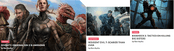
The accident above inspired this unconventional thumbnail presentation:
It looks sexier on larger viewports but you get the point. The awesome thing about these accidents is that it results from a bug in my code but the bug leads to beautiful ideas. This morning, I was tinkering with the code again and a bug leads to this:

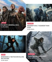
What if it looks like this on mobile devices? I think it looks pretty rad! I haven’t explore where I could take this but it is a possibility in the future.
At some point, I realize that I am coming up with all of these demos by just using grid-columns; I’ve yet to explore any advance CSS Grid features. So I decided to play with grid-template-areas in order to explore what else I can do. With grid-template-areas, I manage to come up with something quite boring and not so experimental:
It looks nice but I am a bit disappointed that I didn’t get to come up with something much more interesting. However, this particular ‘boring’ layout manage to give birth to another experimental idea: comic books.
Comic book layouts are pretty much grid layouts but it is an unconventional one. In certain layouts, the author actually use the layout grid itself in order to make the story more interesting by conveying suspense or anticipation.
I grew up reading Japanese manga, so it is not surprising that my thought process leads me to one of my favourite things. I decided to explore the comic book layout idea by using CSS Grid and Clip Path. This is what I ended up with:
Out of all of my experiments, the comic book layout is the most popular. It shows that creativity itself is an iteration; you wouldn’t get to your goals immediately but with exploration, you can get some interesting and unexpected results. It will not always be pretty but once you get something that you like, it is going to be very beautiful.
I hope I manage to spark your interest in playing with CSS Grid. You can start by rebuilding an existing layout and see where it goes from there. You don’t even have to start with anything fancy. Iterate through your first demo and I believe you can come up with something impressive.